More Touch Experimentation at the OAG

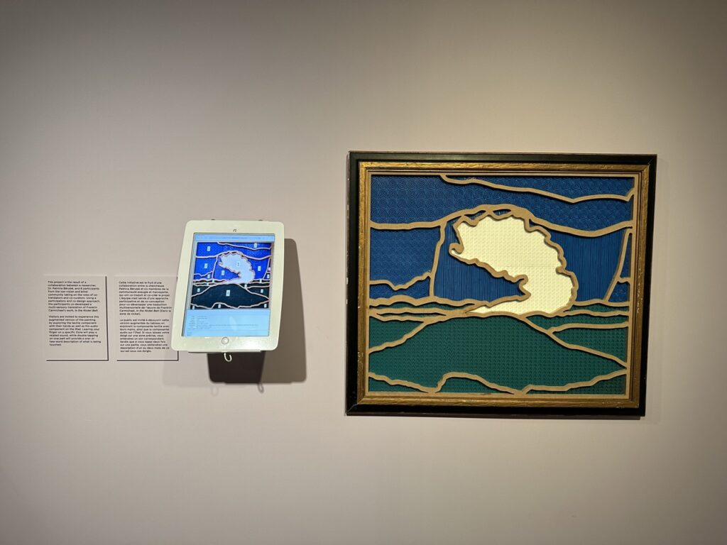
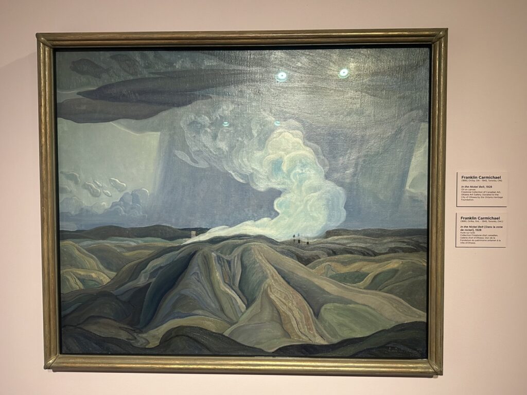
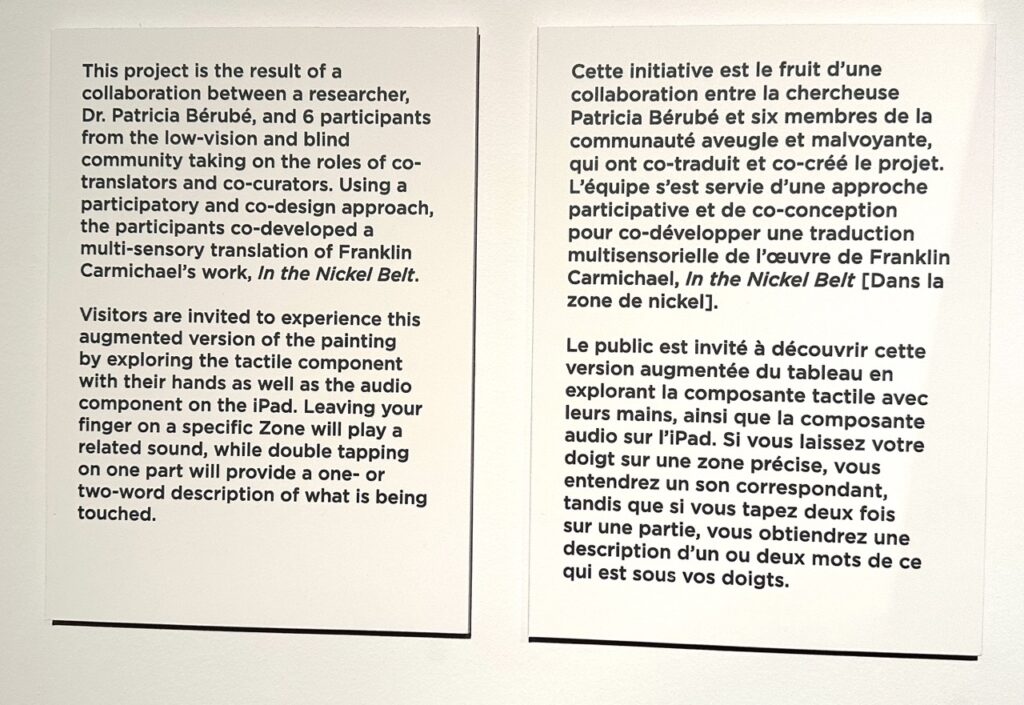
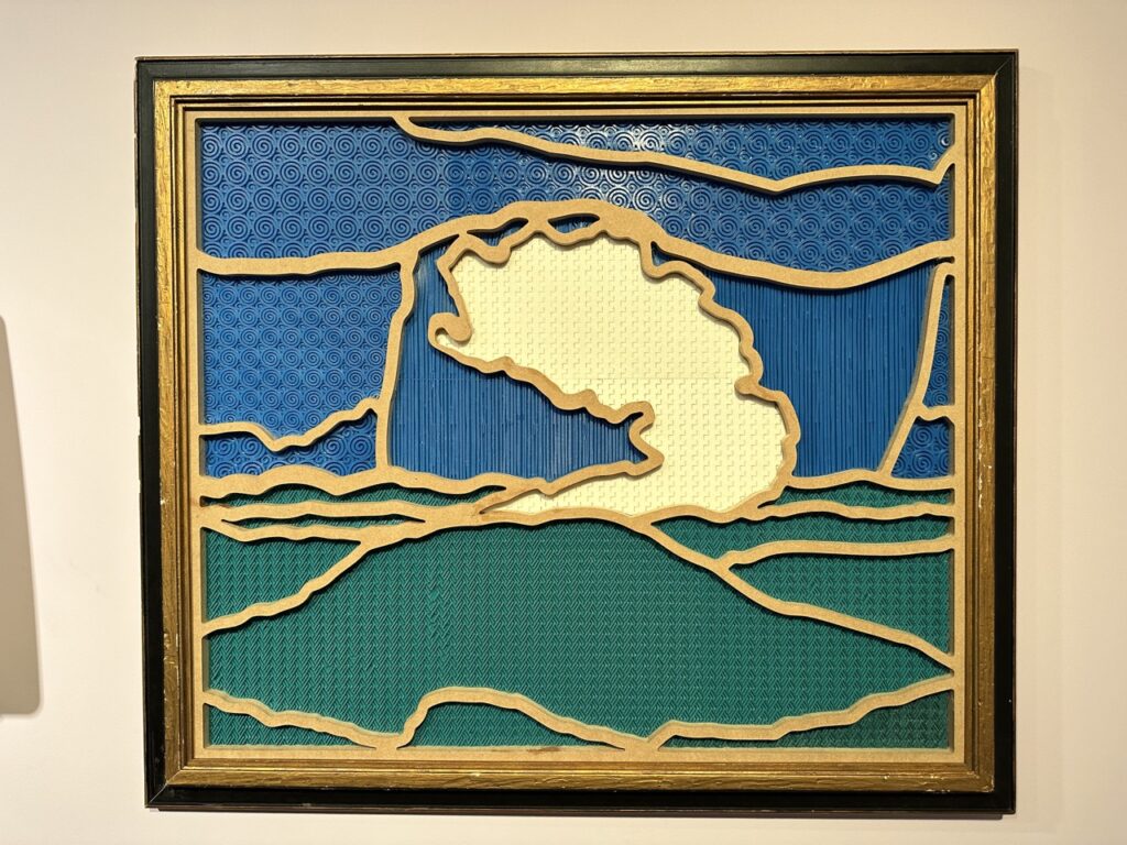
This is the 2nd tactile art piece we’ve seen at the Ottawa Art Gallery (OAG) (see April 8 2020 for the previous piece we experienced there). Unlike the previous, this research project is based on an original artwork – Group of Seven member, Franklin Carmichael’s 1928 “In the Nickel Belt” oil painting. This work is interpretively reproduced as a rubber and wood tactile image with an adjacent iPad surfacing descriptions and sound effects. There is a substantial disconnect between navigating the iPad and the tactile image, going back and forth, which would certainly be a barrier to autonomous exploration for blind users, and the iPad was not set to access mode, meaning sight was required for on-screen orientation and navigation. Yet the interesting point for us with this work, is the dividing up of the paintings various landscape elements, the tactile patterning, and material selections and uses. We’d have more than a few notes for consideration within this experiment to render it more inclusively accessible, but we love that the OAG keeps on exploring various ways of making 2D artwork accessible to a wider audience.

Tactile QR Code: Bourbon Edition

We have been using QR codes in some of our work as a simple way of surfacing access affordances, like visual descriptions of artwork within exhibition and gallery spaces. The final hurdle always remains ensuring the QR code is discernible through multiple modalities – not just visual. Making QR codes tactile is one of the tactics that can help contribute to their findability and usability (lining up the camera with the code). In many cases it has meant printing them with thermoform, 3D printing them, adding stickers to the printed codes, applying the printed code to a container or surface that is tactile, and various other methods. In this case, at The Manhattan Project in Louisville, Kentucky, they were so pleased with using QR codes for their menus during the pandemic, they embedded laser etched versions into their bar top. The bar manager was very happy to discuss the fabrication techniques with us. They were even more pleased to learn that in surfacing their menu in this way (digital on mobile via QR) they have made their menu accessible to many people who would otherwise have faced an access barrier. Digital presented on mobile allows for screen reading, pinching and zooming, color swapping, and more. The high contrast between fore and background helps visual discernibility, and the square itself is tactily distinguishable from the counter.

A light coloured wooden square is inset into a darker coloured wooden barton. The inset contains the letters TMP, followed by the words "The Manhattan Project", followed by a QR code. All 3 pieces of content are etched or laser cut into the surface of the wood and the deep groves are darker in colour providing a high contrast distinction against the un-etched surface. The etching is at a depth that facilitates tactile consumption of the content.
Tactile QR code seen at TMP in Louisville, Kentucky.

Georgia O’Keeffe, Her Chows, and Contrast

If you’ve worked with Sina and I on exhibition design, collections/artefact presentation, or have attended any of our workshops related to the built environment, the inclusive design ecosystem, or inclusive collections practices, you will no doubt recall our emphasis on the importance of edge detection, shape detection, and contrast. These tactics (and several more) greatly contribute to safe and inclusive wayfinding, artefact preservation and protection, and ensuring museum audiences perceive and access content not only in the manner intended by the museum (curatorial, interpretive, and/or design intent), but inclusively and accessibly as well.

It was while in New Mexico last week, touring Georgia O’Keeffe’s house in Abiquiu, that we learned about the upgrades and changes she made to the property over her years there. One such change was the swapping out of dark floors in her bedroom and studio to light coloured carpet. What provoked this change? Georgia O’Keeffe developed Macular Degeneration later in life (affecting her vision). As she was concerned about accidentally tripping over or injuring her beloved chows, she changed the flooring so that their dark haired bodies would present a significantly increased contrast and she would be better able to see and detect them. This is a great (and unique) example of addressing contrast between fore and backgrounds in order to protect, preserve, and facilitate greater inclusive accessibility.

2 dark haired puppies sit on a pale stone floor.
Georgia O’Keeffe’s chows. Image Credit: Georgia O’Keeffe Museum

The Return

Sina and I began this micro blog as a response to expressions of interest that we share those instances we come across, in our travels and across our projects, that present an interesting, unique, or innovative take on experience design. Given it’s us, you can be sure that whatever we chose to spotlight somehow surfaces concepts related to inclusion and access.

What we didn’t predict was a global pandemic stopping our travels the same month we decided to first publish Mosaic (#M4C). 20 months later and travel has ramped back up again. As such, we’re happy to begin picking up where we left off and sharing those notable examples of interesting and inclusive experience design that we come across . (Note: The Reading List and Glossary sections have been kept up to date this entire time).

It’s nice to be out in the world again and we’re looking forward to sharing those instances we come across that can help provoke discourse around meaningful, rich, and inclusive experience design.

Unmute Art

As members of the MuseWeb GLAMi team since 2007 (formerly MW’s BoW), we have been intimately aware of the vast number of international projects submitted, reviewed, and awarded for innovation within the sector. Over this time we have encouraged change towards increasing the importance of inclusive design within the criteria for submissions and in judging formulas. This year it was incredibly refreshing and inspiring to see a project win Best of the GLAMi Awards that was uniquely focused on both inclusion and accessibility.

Unmute Art is a project created by Orpheo for the Andy Warhol Exhibition at the Pietrasanta Basilica in Napoli. This video-guide facilitates the delivery of interpretation through Italian Sign Language (ISL). Using Augmented Reality (AR), the user recognizes the relevant Andy Warhol piece, which provokes the video overlay. Actors were filmed in character matching the subject of the work, and the prompted video delivers the work’s interpretation through ISL.

Not only is the interpretive content made accessible to a historically marginalized community, but the experience is made rich and meaningful, facilitating the enjoyment and education of Warhol’s work by ISL signers, in their first language, without (critically) requiring they look away from the work as they receive the interpretation. This can be done at the same time as those receiving the interpretation in Italian via audio-guide interpretation. A meaningful project that was no doubt fun to produce and can be a great model for other GLAMs (galleries, libraries, archives, museums) to further iterate and build upon.

ISL signing actor made-up to look like the subject of an Andy Warhol art work. The work is highly stylized with boosted brightness and contrast reducing visual detail, and the actor is wearing a yellow sweater with black polkadots, green eye shadow, and set against a solid red background.
Italian Sign Language (ISL) fluent actors were made to resemble the subjects of Andy Warhol’s work so they could deliver seamless interpretation of his works via ISL without necessitating patrons look away from the art in order to view the interpretation.

Tactile Art Commission

“How I Came to Ottawa” by Acadian-Métis artist Eric Walker in 2017 is exhibited at the Ottawa Art Gallery (OAG) and is the gallery’s first special commission of a touchable art work.

The associated label calls attention through text and iconography that the work is intended to be touched. In fact the label invites visitors to “Please Touch!” the artwork. The relief, the materials used, the geometry of its components, and its explicitly detectable edges encourage multi-sensory exploration – visual and tactile.

This artwork and its label invite visitors to explore its subject through both vision and touch. Clearly defined geometric shapes with explicitly detectable edges and relief, facilitate tactile, as well as visual, exploration. 

Animal Relief Area

The Elmira, NY Airport offers a simple and effective animal relief area post security. Complete with fire hydrant, artificial turf, drain, cleanup facilities, etc. it is an excellent example of a janitorial room that has been converted into an affordance of great practical use for many, in particular for those accompanied by service and/or support animals.

Animal relief area inside an airport consists of a red fire hydrant placed on a patch of artificial turf with a nearby coiled hose, bench, sink, and trash and compost.
The animal relief area post security at the Elmira, NY airport.

Hanguel: Alphabet by Design

Literally sitting in the shadow of the National Museum of Korea is the National Hanguel Museum. Hanguel or Hangul is the Korean alphabet. The design story that is Hanguel should be a case study taught across all design disciplines.

The Hanja (Chinese) alphabet, or character set, numbers over 50,000 with each user knowing, on average, 8000 characters. This character set was in use by Koreans until the 15th Century when King Sejong designed Hanguel in an attempt to raise the very low literacy rates amongst the Korean population. Hanguel is the written Korean alphabet and was fully adopted as the national alphabet in 1894. It consists of 24 characters, based on 8 letter shapes mapped to the 5 basic mouth and tongue positions used by the vocal system for consonants, and 3 vowels representing the sky, the earth, and the human.

Translated into glyphs this alphabet is extremely easy to learn and use. The design and introduction of Hanguel has drastically increased literacy rates in Korea. Both South and North Korea now have literacy rates above 98%. This has no doubt played a key role in the unparalleled economic success, social development, and overall inclusive positioning of South Korea in such a short period (since the 1960s).

Hanguel: A written language that is easy to learn and use. (Illustrations taken from National Hanguel Museum Guide: The Journey that Hanguel Went Through, English version)

Braille on Handrails

The braille affixed to this handrail (at the National Museum of Korea in Seoul) is a great way of surfacing information, such as location and orientation within designed wayfinding systems.

Metallic blue and white braille label on handrail of stairs at the National Museum of Korea.

Elevator Seating in Sweden

It was great to see the inclusion of low profile foldable seating inside this elevator in Malmö, Sweden. An excellent example of an in-elevator seating affordance.