Tactile QR Code: Bourbon Edition

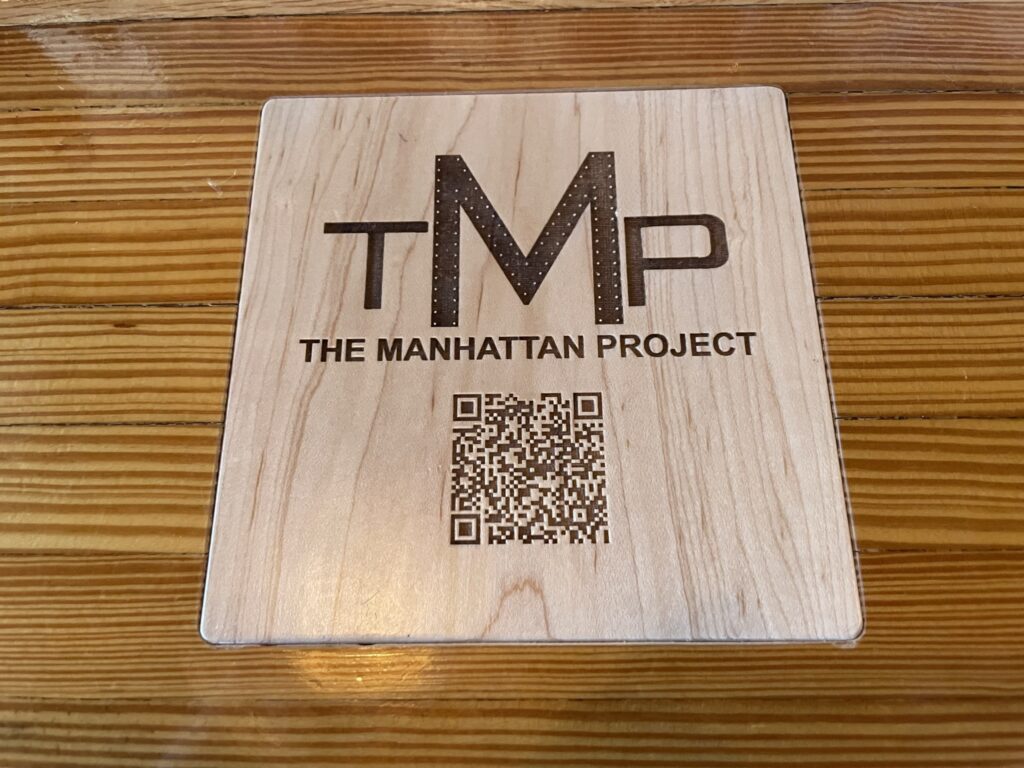
We have been using QR codes in some of our work as a simple way of surfacing access affordances, like visual descriptions of artwork within exhibition and gallery spaces. The final hurdle always remains ensuring the QR code is discernible through multiple modalities – not just visual. Making QR codes tactile is one of the tactics that can help contribute to their findability and usability (lining up the camera with the code). In many cases it has meant printing them with thermoform, 3D printing them, adding stickers to the printed codes, applying the printed code to a container or surface that is tactile, and various other methods. In this case, at The Manhattan Project in Louisville, Kentucky, they were so pleased with using QR codes for their menus during the pandemic, they embedded laser etched versions into their bar top. The bar manager was very happy to discuss the fabrication techniques with us. They were even more pleased to learn that in surfacing their menu in this way (digital on mobile via QR) they have made their menu accessible to many people who would otherwise have faced an access barrier. Digital presented on mobile allows for screen reading, pinching and zooming, color swapping, and more. The high contrast between fore and background helps visual discernibility, and the square itself is tactily distinguishable from the counter.

A light coloured wooden square is inset into a darker coloured wooden barton. The inset contains the letters TMP, followed by the words "The Manhattan Project", followed by a QR code. All 3 pieces of content are etched or laser cut into the surface of the wood and the deep groves are darker in colour providing a high contrast distinction against the un-etched surface. The etching is at a depth that facilitates tactile consumption of the content.
Tactile QR code seen at TMP in Louisville, Kentucky.

Last of Us Part II: Inclusive Design & Video Games

Naughty Dog Studios recently released Last of Us Part 2, a video game with over 60 inclusive design affordances built right in to help gamers of all abilities enjoy this title. From vibrotactile feedback to increased contrast and text to speech, and so much more, this video game goes above and beyond to deliver a best in class accessible experience in a mainstream title.

It is not often that we find ourselves truly impressed by the sheer range, quality, and thoughtfulness of accessibility features in a single offering. The team at Naughty Dog, the gamers with disabilities who contributed countless hours of testing and advice, and the advocates that have spent decades fighting for video games to include more audiences deserve a round of applause for the hard work that has gone into this title.

We really enjoyed reading Victor Branco’s review of the game. He details all the features that enable him, as a gamer with low vision, to play the game. The PlayStation blog also has a detailed listing of all the accessibility features in the game.

The Last of Us Part 2 video game screenshot shows high contrast blue and red figures on a grey background with a yellow bottle in the foreground.
A screenshot from The Last of Us Part 2 video game in high-contrast mode.

Unmute Art

As members of the MuseWeb GLAMi team since 2007 (formerly MW’s BoW), we have been intimately aware of the vast number of international projects submitted, reviewed, and awarded for innovation within the sector. Over this time we have encouraged change towards increasing the importance of inclusive design within the criteria for submissions and in judging formulas. This year it was incredibly refreshing and inspiring to see a project win Best of the GLAMi Awards that was uniquely focused on both inclusion and accessibility.

Unmute Art is a project created by Orpheo for the Andy Warhol Exhibition at the Pietrasanta Basilica in Napoli. This video-guide facilitates the delivery of interpretation through Italian Sign Language (ISL). Using Augmented Reality (AR), the user recognizes the relevant Andy Warhol piece, which provokes the video overlay. Actors were filmed in character matching the subject of the work, and the prompted video delivers the work’s interpretation through ISL.

Not only is the interpretive content made accessible to a historically marginalized community, but the experience is made rich and meaningful, facilitating the enjoyment and education of Warhol’s work by ISL signers, in their first language, without (critically) requiring they look away from the work as they receive the interpretation. This can be done at the same time as those receiving the interpretation in Italian via audio-guide interpretation. A meaningful project that was no doubt fun to produce and can be a great model for other GLAMs (galleries, libraries, archives, museums) to further iterate and build upon.

ISL signing actor made-up to look like the subject of an Andy Warhol art work. The work is highly stylized with boosted brightness and contrast reducing visual detail, and the actor is wearing a yellow sweater with black polkadots, green eye shadow, and set against a solid red background.
Italian Sign Language (ISL) fluent actors were made to resemble the subjects of Andy Warhol’s work so they could deliver seamless interpretation of his works via ISL without necessitating patrons look away from the art in order to view the interpretation.